Chandra's Got A New Look
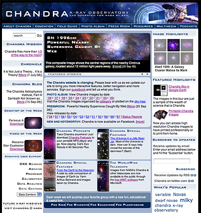
The Chandra X-ray Observatory Center web site chandra.harvard.edu has been in existence for over ten years. In that time the Chandra Education & Public Outreach team has worked to improve content delivery, utilize new technologies and attempt to provide a fun, educational experience. Last week, the web group released a major revision that kept the overall basic design, navigation and search principles intact while allowing greater user control in content delivery. The new graphical design builds on existing elements but lends a more modern look.

New top page of chandra.harvard.edu
Most notably the site grew in screen real estate— approaching a more commonly accepted wide-screen size to fit more information on each page and allow larger image/video and multimedia window sizes. The Chandra web site redesign is aiming to follow the “less click†methodology: fewer clicks to find the information you need. We are highlighting more features that might have been buried previously. We have added show/hide drop down buttons and controls to help decrease page depth. We are bringing popular features closer to the top. The goal is to make it much easier to locate desired information, allow more dynamic browsing and provide a better overall experience. Look for more new features in the coming months as we continue to refine the web site, including “You-tube style†videos, high definition products, more podcasts, better cross-linking, additional interactivity, web services and much more.
Tell us what you think about Chandra's new look. Send us your feedback!
-Kim Arcand and the Chandra web team: Lisa Portolese, Khajag Mgrdichian, Alaalden Ibrahim and designer Melissa Weiss.
Please note this is a moderated blog. No pornography, spam, profanity or discriminatory remarks are allowed. No personal attacks are allowed. Users should stay on topic to keep it relevant for the readers.
Read the privacy statement
